Uncategorized07 Feb 2017 09:26 am

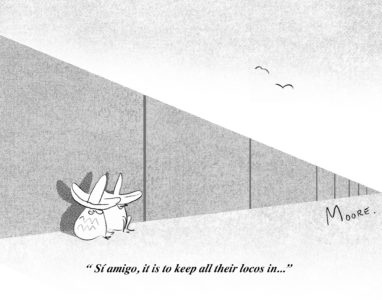
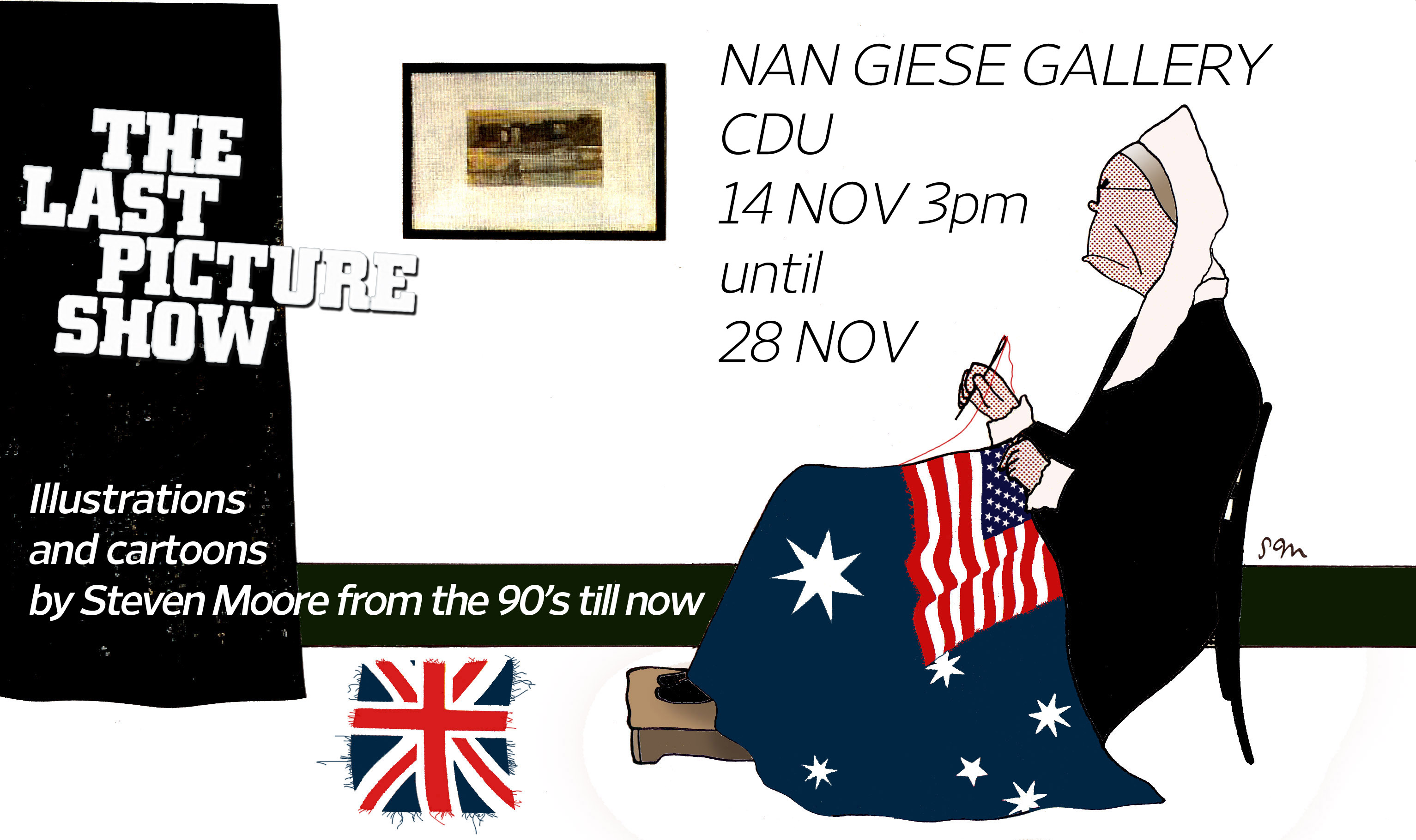
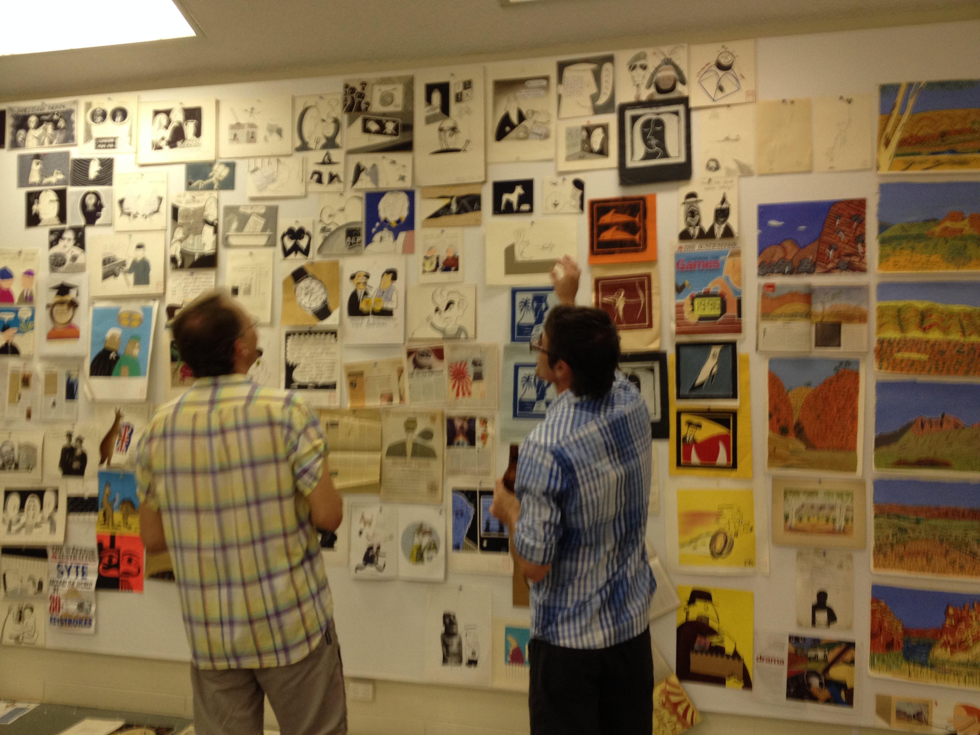
Last year I was approached by a Tokyo Illustration Agency for a commission to produce a “New Yorker” retro style illustration for an insurance firm. The low down was all the people who they normally may have sought out to do such work are either as the Hoodoo Gurus might say ‘dead or dying’. Somehow they found my cartoons. I was perplexed to say the least.

So now a little dream has come true and  Art Liaison have offered to represent me and as such  I have an international agent! Thank you very much Art Liaison!!

Best go and sign the contract and get some images ready for their website.

Looking forward to some serious pipe smoking martini quaffing inspired drawing. Well when the lens prescriptions increase, the arthritis kicks in and I  have a grey beard…

Whilst I would utterly reject the claim of being a plagiarist I will admit that I love several of the cartoonists’  work from The New Yorker from the past. One in particular is Frank Modell whose sense of humour and deftly zen like drawing style has inspired me greatly. He  sadly passed last year. Frank Modell was simply brilliant and his style epitomised the New Yorker ethos. In an article from the The NY Times Iain Topliss author of “The Comic Worlds of Peter Arno, William Steig, Charles Addams and Saul Steinberg” (2005) quoted a party conversation Modell recounted with another guest:

“What do you do?”

“I’m a cartoonist.”

“I love cartoons. Where do you publish?”

“The New Yorker.”

“I love The New Yorker. What’s your name?”

“Frank Modell.”

“Yes? [Pause.] I’ve never heard of you.”

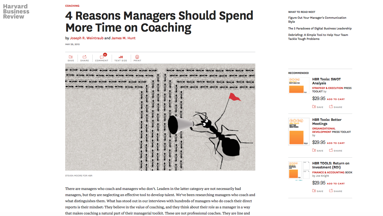
below is another article canvassing the opinions  of past and present New Yorker cartoonists.
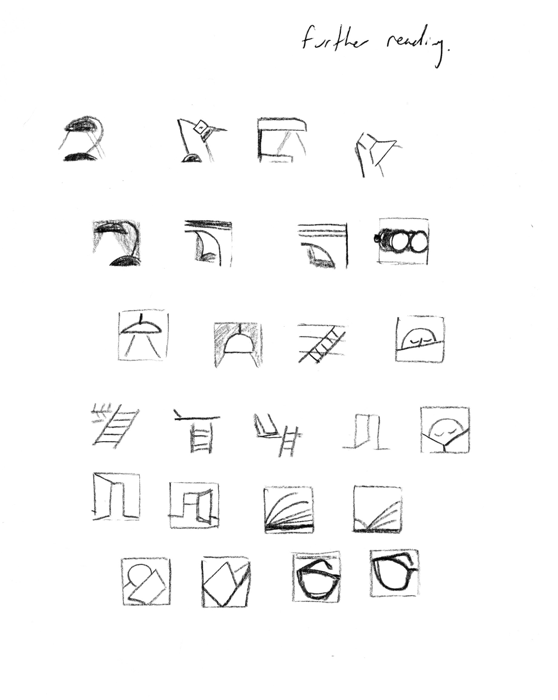
Ah one day….

A gaggle of cartoonists.


Uncategorized03 Feb 2017 10:47 am

In November I was commissioned by The Australian to produce illustrations for their supplement The Deal, which was a special edition focusing on Women Leaders and workplace issues. When I received the articles I was a little panicked.  I joked that perhaps I should use a feminine alias! In fact I was initially stumped, I leapt straight into a headspace of  “I am male, I cannot illustrate from a feminine perspective, which is surely what this requires, this is headed straight to Disasterville.” However  I’m not one to baulk at a challenge and put aside any issues of ‘maleness’ and entered a healthy space of recognising that to do these articles justice they had to be approached as purely graphic solutions. Once I gained some traction by utilising some found onlinefunky 50s Peter Ganine chess pieces to depict role types and so forth it was plain sailing. This idea of chess pieces extended to a queen in a deck of cards also for one story adding feminist symbols and an assortment of famous slogan badges. The editor was very happy with the results and I think the images had a strength that endorsed the concepts within the stories. Phew.

Uncategorized02 Feb 2017 10:44 am

How do you start to visualise a concept for an illustration when you have a story or brief? Sometimes the ideas just hit you from the word go but even then you have to test the validity of the solution, better to be completely open to seeing the problem in other ways and feel your way through it, often your first idea can be your best (or worse the only one!), however it is also good practice to be prepared to enthusiastically dump that first idea, completely detach from it, and approach the problem from a different angle. That was described to me at college by a wise man “not to be precious about an idea”. Great advice. To me that entails being able to perceive your communication  directly from the viewers situation, what will draw them in? You need to somehow lure the viewer in with something that attracts them to follow on and digest the communication being presented. I take the view that an illustration’s purpose is to add meaning, using the standard bag of tricks that include metaphor, puns and stylistic devices, technique, I also seek simplication and distillation of visual information which can be used to deliver an idea directly and quickly.  This all includes the what are we communicating, who are we communicating to, and how is this best communicated.

So that starting point requires a genuine understanding of the intention of the communication. Research is assisted by the availability of that gigantic stream of material which is online. It’s all there before us. There’s no such thing as a new idea. Never. Before the internet kicked off one had to use whatever was available to kickstart an idea. This can include key words which can then be bounced around to develop meaningful associations. Meaningful. By looking at related information one can commence gathering images or words that can begin to build up a scrapbook of clues that can then be used to develop an idea. I’ll simply dump something related to the topic onto my image I’m working on and see if I can extract something from it, sometimes yes more often they can be simply a dead-end,which leads to searching deeper. Being able to tap into some  intuition doesn’t go astray and keeping an open mind to finding inspiration in associated imagery or concepts.

Basically I first digest the content of the communication. I find a good practice if I’m genuinely stuck for an idea and time is available is to just simply switch off and then pounce on it when you have cleared the fug of block. It can be useful to read a piece or think about it before  sleeping and ‘store it’ in the hope the subconscious might get involved, and quite often when you wake up you can just go straight into finding a solution in the morning.

The two images below were prepared for an article appearing in Readers Digest that discussed the notion that sedentary work practices created by sitting on chairs all day was causing damage to our postures and well being. The image then possibly needed to imply that sitting for prolonged periods is  potentially bad for us. The first one was a rough, by personifying the chairs (a standard visual trick) the notion is mobility beats a static state (happy leaping chair vs grumpy immobile chair). The second image however was chosen and this again uses personification but with far more sinister implications. You’re going to die on that seat folks…


Uncategorized31 Jan 2017 04:35 pm

Uncategorized31 Jan 2017 01:53 pm

Another post, two in one year, incredible. I might graduate to social media at this rate! Anyway I have been a contributor to AFR and specifically the magazine that comes out once a month for nigh on 20 years now, seriously, and have recently been involved in illustrating the book reviews page. I did what I thought was a cracker and wanted to share it, the agent for the author (Jane Harper The Dry Pan MacMillan)  requested reuse for her website as they liked it, now if only I could beat some of those photographers to a commission for a cover! Good luck with that Steven…

The novel deals with some gruesome family crime set in a rural region. That made my thoughts fly!


Uncategorized18 Jan 2016 02:46 pm

I’ve just started working with Medium Rare Content Agency assisting with illustration commissions  on the revamped Qantas Magazine. I’m fully schtoked!

q1q2


Uncategorized15 Sep 2015 05:13 pm

Everything these days exists in a “land”, Liquorland, Sexyland, and so on. As an illustrator the days of seeing your work in print are diminishing by the second. That’s fine with me. No more paper. Just millions of gadgets to dispose of one day : )

Screen Shot 2015-09-14 at 12.44.58 pm Screen Shot 2015-09-14 at 12.44.42 pm Screen Shot 2015-09-14 at 12.43.32 pm Screen Shot 2015-09-14 at 12.44.21 pm Screen Shot 2015-09-14 at 12.42.56 pm


recently I  did some work for Harvard Business Review topics and some for the Responsible Gambling Inside Gambling emag.

http://www.insidegambling.com.au/editions/1/articles/so-totally-random


http://www.insidegambling.com.au/editions/1/feature/teenage-gambling-a-business-thats-only-getting-riskier


http://www.insidegambling.com.au/editions/1/feature/simulated-gambling-online-incubation-or-inoculation


Uncategorized11 Feb 2015 03:01 pm

Awhile back now I completed an interesting commission from The Harvard Business Review Magazine to create icons to accompany various thematic topics and articles. It’s tricky stuff simplifying/illuminating a concept into a printable area literally 6mm square!

In order to successfully visualize the idea into an immediately recognizable image requires a bit of planning and skill. I   researched some personal favourites in  the history of pictograms, Isotope and the everlasting modernism of the 1968 Mexico Olympics pictograms by a team including Lance Wyman.

Initiating ideas in sketches and then road testing, throwing out ideas, brain storming, innovating are all part and parcel to this somewhat brain wracking activity. I enjoyed the challenges of the job and whilst demanding  was happy with the final results which were an individual contemporary instalment into the language of iconography/pictograms. I think!


roughs HBR_icons

Uncategorized05 Feb 2015 09:29 am

I do illustrations for this publication in the States, when asked to illustrate a Q&A article with Steven Heller and Tim Hoover covering design/entrepreneurship I looked at the idea of abstract thinking morphing into concrete action, so the image has the idea bubble becoming a physical entity. I had also just taken up welding with MIG and oxyacetylene  so it was on my brain… lots of hot dangerous fun welding metal.

I was excited to do an illustration connected to Steven Heller, he is a bit of graphic design guru with the publication of many well researched and presented titles on the subject. In fact his work is likely referenced more than anyone else on the design form.


DMI_HELLLER_HOOVER_MOORE

Uncategorized16 Jan 2015 10:14 am

In December of 2013 I prepared a small (but chockablock) exhibition of old work I had kept over 20 years in two big woolpack storage boxes. I have been hanging on to all these pictures and thought maybe it was time to dust them off and see how far I haven’t gone with my career as an illustrator.

It was held at CDU Nan Giese Gallery. I just filled the walls with pictures indiscriminately, jamming as much in as I could. I still had half a box left over. Titled “The Last Picture Show” a good friend Mark Hilton strummed some of his tunes and sang as a small group of good folk assembled to marvel at my incredible skills and remember the Howard years.

As I was keen to let these pictures go I sold them off for charity, money raised going to the UNICEF Children’s Fund for Syria, it is truly repugnant (and always the way) the  innocent and fragile are subjected to adult violence and the level of brutality that is occurring in this once beautiful country is utterly sickening. Q: When are people going to figure it out? A: Never.

We only raised about $750 but it all helps I hope. I was disappointed more people didn’t come along.

GIESE SHOW inviteIMG_2566IMG_2687IMG_2695IMG_2705


Next Page »